If you have been to Bright Eyes Family Vision Care, you might have noticed some changes. We always trying to keep the office fresh and update and we think you'll agree these changes are an improvement.
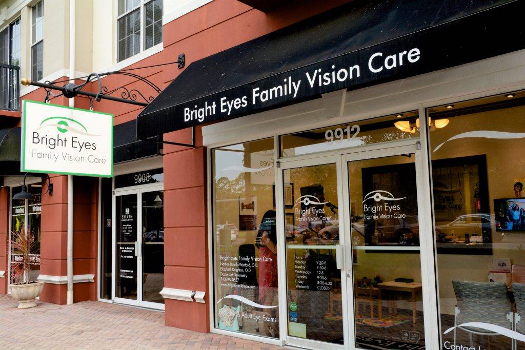
The first change was to the outdoor blade sign. We've had that sign for 10 years and we wanted to give it an updated, modern look. We think it looks great.
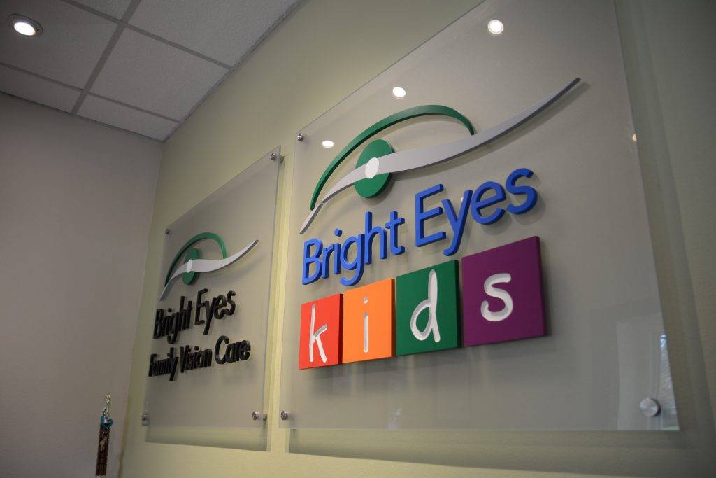
Even more important, the sign behind the front desk has changed. Why? Well, we always like the silver one that said Bright Eyes Family Vision Care, but we wanted the new sign to reflect that fact that we are kid friendly, too. In fact, we provide all of the same specialty services for children (vision therapy, myopia control, and ortho-k) in Westchase as we do at the New Tampa location. So we added the colorful and fun Bright Eyes Kids logo to the sign as well.
What do you think? They look sharp, right?
-Dr. Nate
Leave a Reply